Art: Charlotte Strick.
All the decision-makers loved Strick’s cover for Karl Ove Knausgaard’s famed series. Until they didn’t. Read the story of “killed covers.”
Beginning authors often fantasize about the illustration they want for their cover, learning quickly the choice isn’t up to them. Meanwhile, illustrators may think they got the cover job — only to find out how a sales mentality can overrule good design.
Zachary Petit at Fast Company begins today’s story with one illustrator’s experience with a book series I have read.
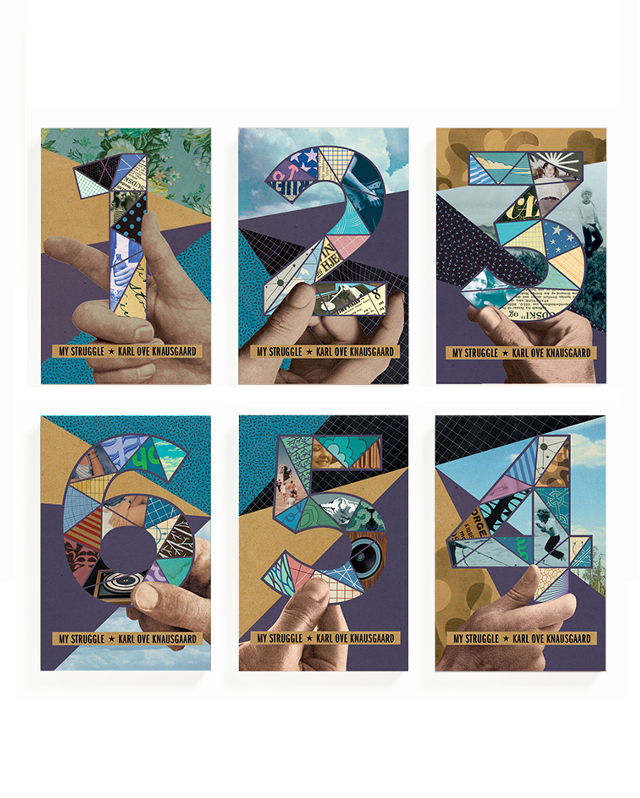
“Charlotte Strick was on a high,” he writes. “She’d been tasked with designing the book covers for the English translations of Karl Ove Knausgaard’s six-part autobiographical novel, My Struggle — and she’d landed on a concept to tie the volumes together. Perhaps surprisingly, everyone else had, too. The collaged, Easter egg–laden set was an immediate hit in cover meetings at Farrar, Straus and Giroux, and the first book had hit shelves, but then Strick says a literary agent intervened. The books looked too artsy, and he wanted something more straightforward to reach the masses. So with only one installment on the market, the line got scrapped for a more traditional look — author photo with big, clean type, and a solid blurb.
“ ‘There’s nothing scarier than [someone saying], “this book is not going to sell with that cover,” ‘ Strick says. …
“Strick says that in general, the process begins with a designer receiving the manuscript and a jacket brief outlining the mandatory elements (e.g., title, author name, maybe a blurb), and comparison titles for reference. The timeline is usually tight, and when it comes down to it, the creative stakes are high: You’re essentially tasked with creating a single image to brand thousands of words that could have been years in the making. …
“From there, designers create comps, or a series of proposed designs for the team to weigh. The reasons why some comps meet untimely ends are many, from an editor or marketing lead’s personal preferences to genre conventions to performance metrics of similar approaches to the author’s best friend’s opinion or, maybe, the sheer fact that an exec has a cold that day. Of course, this isn’t to say that what hits the market is bad — in fact, I’d contend we’re in a golden age of book cover design, with each publishing season bringing a deluge of insanely great jackets. But at the end of the day, a lot of fantastic and fascinating work hits the cutting room floor.
“So as ‘Best Book Covers of the Year’ lists pop off this month, let’s celebrate the work that didn’t win the day. Here are some of the best book covers of 2023 that you did not see — with insight directly from the designers who created them.
The version that ended up being scrapped is on left, the final version is on the right.
“ ‘I love the cover that was chosen so much (the big dark waves backdropping the brittle lines of sheet music evoke the sweeping story and emotional impact), but there is one outtake that is stuck in my head when I think of the book. There is one scene at the end that I can’t let go of: Music tying two people together is played, and images of people lost appear in redacted colors of light. Whether real or illustrative, this is the image that held everything that happened in the story in a suspended moment before the exhale of finishing the book. I wanted to create that scene but without any visual clutter of a setting, other objects in the room, or even people. In this outtake everything but the crucial information fades to black. It is the simplicity and starkness that I find so appealing.’ —Math Monahan, illustrator of the Refugee Ocean’s first cover.
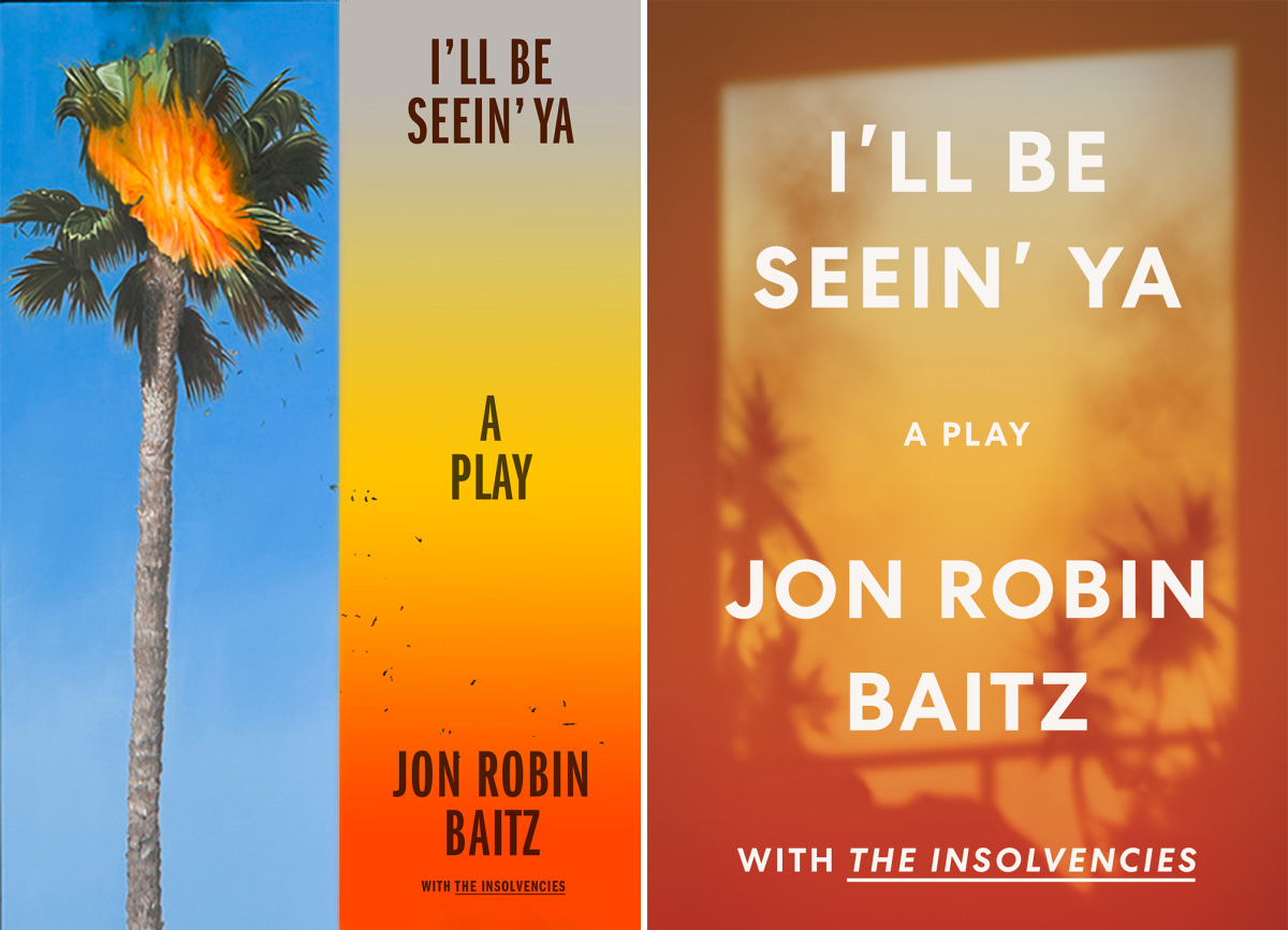
“I’ll Be Seein’ Ya by Jon Robin Baitz is a play set in turbulent COVID times, examining the relationship between nostalgia and the ever-looming anxieties surrounding mortality and old age. I began with this painting by artist Perry Vásquez. The spontaneously combusted palm tree captured the sudden, disorienting, and solitary atmosphere of living alone in pandemic times, while also alluding to the LA forest fires. I enjoyed how this symmetrical, two-paneled composition suggests a ‘before and after’ sequence marking the initial spark and the gradual expansion into forest-fire-orange California sunset. —Cecilia Zhang.’ ”
I like Zhang’s concept more than the one that prevailed, but then, I would. I haven’t forgotten a negative experience I had with Jon Robin Baitz the time I was assigned to interview him for TheaterMania. He was really full of himself and rude because a stringer such as I was (who gets $70 for working hard on the writing) may not have had a chance to see the play.
But back to book covers. What are your reactions to book covers? Laurie Graves does get to pick hers and Asakiyume has done that, too. But when any of us put on our reader hats, we often get indignant about a cover we think was very misleading. Let me know if you can think of an example.
See more Befores and Afters at Fast Company, here.