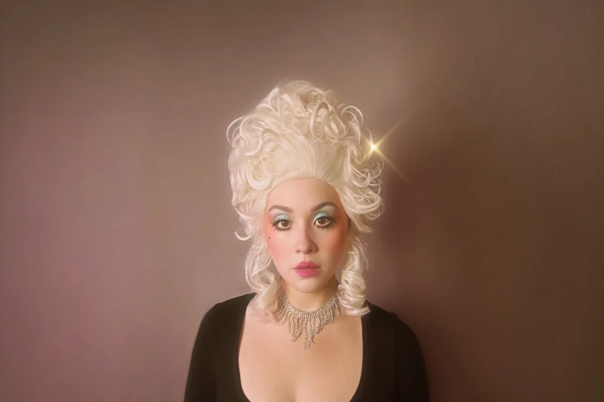
Feeds:
Posts
Comments

Posts Tagged ‘marketing’

Photo: Amy O’Neil.
Amy O’Neil, the Digital Content Marketing Manager for the Dallas Opera, has earned the organization a new following thanks to her quirky, fun, and innovative videos that explain everything.

Many people adore opera, but there are also many who are sure they wouldn’t like it, even though they’ve never tried. So how is Dallas Opera attracting new, younger audiences?

Bethany Erickson at D magazine interviews the brains behind the change.

A few of the Dallas Opera orchestra’s musicians were ready to leave after practice, but a handful were still milling around their rehearsal space in the Winspear Opera House. Some of them were gathered around a machete-wielding percussionist as he attempted to mimic the sound a guillotine makes as the blade descends to chop off someone’s head. 

“After tries with other instrument combinations yield OK but not spectacular results, he stands next to a metal pole, then slides the machete against it, the metal-against-metal action creating a ‘snick’ and then a long, slicing ‘hiss’ as the machete descends, followed by a heavy thunk at the end. …

“On hand to capture the behind-the-scenes work for the season’s second production, Dialogues of the Carmelites, [Dallas Opera social media guru Amy O’Neil] says she’s not sure exactly what she’ll use the footage for, but she wasn’t going to miss filming it.

“That sort of infectious creativity has made O’Neil’s work for the Dallas Opera a must-watch. From her fun, punchy synopses of upcoming productions to her award-nominated series ‘Don’t Look Under the Wig,’ she says her work is aimed at making the opera feel more accessible. …

“O’Neil has been with the Dallas Opera for more than six years, starting in group sales before convincing her employer that her talents might just attract a new wave of opera buffs. A UNT graduate, she studied business, music, and communications, and then spent time abroad studying, among other things, classical music and opera history in Vienna. She also does improv and is a musician. …

“O’Neil and I sat down at a table overlooking the Winspear’s expansive lobby to talk about her work. What follows has been edited for clarity and brevity.

Bethany Erickson
“I told my coworkers to check out the Dallas Opera social media feed because it was so fun.

Amy O’Neil
“Oh my god, I have so many more things about to come out that are more me, just telling our audience things, because time and time again, that’s what performs well. Like, they just want to see me as a goofy regular person, going, ‘Can you believe this? She’s cursed and on a random island,’ and whatever.

Erickson
“So take me back in time to when you first started.

O’Neil
“I started in ticketing, and then I did group sales, and then I was social media, and now I’m, like, all things digital. … They were coming to me and saying, ‘We want you to do a program or whatever you want where you’re doing makeup stuff,’ and that’s where ‘Don’t Look Under the Wig’ came in. And that really opened the door to not only show the company, ‘Oh, hey, I can do all these other crazy things,’ but also to test how I did with the people out there. …

“The first time I did a synopsis, it was because we didn’t have any ready-to-go assets, and I was like, ‘I’ll come up with something.’ … I wrote it, filmed it, and edited it all within like 2 1/2 hours. And I mean that’s, like, my shortest synopsis, like a minute and a half, so it’s not like impressive or anything. It took off, and then it was like, ‘Oh, well, maybe I should do this for the next opera.’ …

Erikson
“I don’t envy you having to figure out the tone for the Dialogues of the Carmelites synopsis. …

O’Neil
“It’s interesting because we were talking about this recently. I wanted it to be unbelievably clear that Dialogues of the Carmelites is based on a real story about real nuns who were really beheaded and persecuted for their religion and died martyrs. … I can make housewife jokes about Don Carlo, but not about Dialogues of the Carmelites. … I want to do the Dialogues of Carmelites and still have it be a fun video, but not at the cost of disrespecting the art. It’s just a fine line. …

“One of my favorite things that happened last season was when I was just walking around before a show in the hall, taking pictures and whatever. And these two girls ran up to me. And they were like, ‘Oh my god, you’re the reason we’re here.  We just had to tell you because you’re the reason we’re here. When we saw you, we had to tell you.’ ”

More at D Magazine, here. Note that long before Dallas explained opera, both Looney Tunes and Disney took it on. Check out Bugs Bunny, here, and Willie the Whale, here.

Read Full Post »

Art: Charlotte Strick.
All the decision-makers loved Strick’s cover for Karl Ove Knausgaard’s famed series. Until they didn’t. Read the story of “killed covers.”

Beginning authors often fantasize about the illustration they want for their cover, learning quickly the choice isn’t up to them. Meanwhile, illustrators may think they got the cover job — only to find out how a sales mentality can overrule good design.

Zachary Petit at Fast Company begins today’s story with one illustrator’s experience with a book series I have read.

Charlotte Strick was on a high,” he writes.  “She’d been tasked with designing the book covers for the English translations of Karl Ove Knausgaard’s six-part autobiographical novel, My Struggle — and she’d landed on a concept to tie the volumes together. Perhaps surprisingly, everyone else had, too. The collaged, Easter egg–laden set was an immediate hit in cover meetings at Farrar, Straus and Giroux, and the first book had hit shelves, but then Strick says a literary agent intervened. The books looked too artsy, and he wanted something more straightforward to reach the masses. So with only one installment on the market, the line got scrapped for a more traditional look — author photo with big, clean type, and a solid blurb.

“ ‘There’s nothing scarier than [someone saying], “this book is not going to sell with that cover,” ‘ Strick says. …

“Strick says that in general, the process begins with a designer receiving the manuscript and a jacket brief outlining the mandatory elements (e.g., title, author name, maybe a blurb), and comparison titles for reference. The timeline is usually tight, and when it comes down to it, the creative stakes are high: You’re essentially tasked with creating a single image to brand thousands of words that could have been years in the making. …

“From there, designers create comps, or a series of proposed designs for the team to weigh. The reasons why some comps meet untimely ends are many, from an editor or marketing lead’s personal preferences to genre conventions to performance metrics of similar approaches to the author’s best friend’s opinion or, maybe, the sheer fact that an exec has a cold that day. Of course, this isn’t to say that what hits the market is bad — in fact, I’d contend we’re in a golden age of book cover design, with each publishing season bringing a deluge of insanely great jackets. But at the end of the day, a lot of fantastic and fascinating work hits the cutting room floor.

“So as ‘Best Book Covers of the Year’ lists pop off this month, let’s celebrate the work that didn’t win the day. Here are some of the best book covers of 2023 that you did not see — with insight directly from the designers who created them. 

The version that ended up being scrapped is on left, the final version is on the right.

“ ‘I love the cover that was chosen so much (the big dark waves backdropping the brittle lines of sheet music evoke the sweeping story and emotional impact), but there is one outtake that is stuck in my head when I think of the book. There is one scene at the end that I can’t let go of: Music tying two people together is played, and images of people lost appear in redacted colors of light. Whether real or illustrative, this is the image that held everything that happened in the story in a suspended moment before the exhale of finishing the book. I wanted to create that scene but without any visual clutter of a setting, other objects in the room, or even people. In this outtake everything but the crucial information fades to black. It is the simplicity and starkness that I find so appealing.’ Math Monahan, illustrator of the Refugee Ocean’s first cover.

I’ll Be Seein’ Ya by Jon Robin Baitz is a play set in turbulent COVID times, examining the relationship between nostalgia and the ever-looming anxieties surrounding mortality and old age. I began with this painting by artist Perry Vásquez. The spontaneously combusted palm tree captured the sudden, disorienting, and solitary atmosphere of living alone in pandemic times, while also alluding to the LA forest fires. I enjoyed how this symmetrical, two-paneled composition suggests a ‘before and after’ sequence marking the initial spark and the gradual expansion into forest-fire-orange California sunset. —Cecilia Zhang.’ ”

I like Zhang’s concept more than the one that prevailed, but then, I would. I haven’t forgotten a negative experience I had with Jon Robin Baitz the time I was assigned to interview him for TheaterMania. He was really full of himself and rude because a stringer such as I was (who gets $70 for working hard on the writing) may not have had a chance to see the play.

But back to book covers. What are your reactions to book covers? Laurie Graves does get to pick hers and Asakiyume has done that, too. But when any of us put on our reader hats, we often get indignant about a cover we think was very misleading. Let me know if you can think of an example.

See more Befores and Afters at Fast Company, here.

Read Full Post »