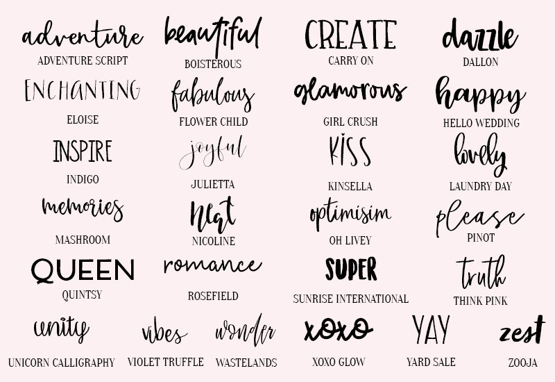
A collection of fonts from Nap Time Alternative.
When I was a kid and my father was a reporter for a Rockland County paper called the Journal News, he took me once to see how type was laid for printing. The newspaper was still using metal type. The typesetter explained how he had to think “mirror image” for the words to come out right when printed. I have been interested ever since.
The days of metal type are gone except among artisans, but the topic of type is still interesting to me. Sara Friedman at Hustle has a story on some new fonts and the struggle of independent “foundries” to get visibility.
“Ten years ago, Cindy Thomason was walking down the stairs at home when she heard her phone ring. On the other end was an executive from Warner Bros. Entertainment, calling to let her know that a font she designed would be featured in the upcoming blockbuster adaptation of the Great Gatsby.
“ ‘I had to sit down,’ Thomason says. ‘I’m just somebody who decided to design a font on a whim.’
“A nurse in suburban Virginia, Thomason began tinkering with fonts in her free time using a software package she bought for $100. She’d listed the font, which she named Grandhappy, on an online marketplace called MyFonts.
“That’s where producers from Warner Bros. found it, and bought it to use as Jay Gatsby’s handwriting in the 2013 film.
It should have been a dream come true, a big break for a hobbyist font designer. But Thomason’s cut for her design’s feature-film cameo was a whopping $12 — not even enough to recoup what she paid for her design software.
“Thomason’s story isn’t an anomaly. … With 4.5k independent artists selling on MyFonts today, many struggle to attract customers and to make a living in an oversaturated market.
“It’s only getting harder, as designers must compete with and abide by the terms of one company that’s approaching behemoth status: Monotype. The company owns not only many of the world’s most popular fonts but also exchanges like MyFonts where font designers bring their work to market.
“The industry is inching toward a monopoly, and it’s leaving independent designers with fewer places to go. …
“Monotype arrived at the end of the 19th century. The company was founded in Philadelphia by Tolbert Lanston, whose monotype machine invention allowed for increased speed and efficiency when producing type. Over the next few decades, Monotype, by then with branches in the US and the UK, developed popular typefaces such as Gill Sans, Perpetua, and Times New Roman.
“In the last half of the 20th century … the mechanized process of Monotype’s signature machine faded out, replaced by phototypesetting and then digital typesetting, bringing fonts to screens. …
“Monotype [went] public with stock-ticker name TYPE in 2007. The retooled Monotype saw its annual revenues climb from $107m in 2010 to $247m in 2018 and became a powerhouse. …
“Monotype has claimed its purchases made life better for customers, who only have to navigate a licensing agreement from one company to access a bevy of fonts. But one font designer believed the acquisition of Hoefler & Co. felt like ‘a kraken eating up the industry.’
“MyFonts is known in the industry for being the gold standard for audience reach. Ellen Luff, who runs Ellen Luff Type Foundry and whose Larken font (starting at $42) is a MyFonts bestseller, told the Hustle there’s little choice but to use the site.
“ ‘When you’re independent, you’ve got your freedom, which is great. But then you have to balance being overlooked.’ …
“The power of Monotype and MyFonts isn’t the only obstacle for independents. Luff has spotted her fonts being used by corporations such as Apple and NASA, sometimes without her permission. Luff says half of her clients come from retrospective licensing agreements made after she’s found her designs being used illegally. But going up against large companies is no easy feat for independent designers who have no legal teams to support them in negotiations.”
More at the Hustle, here. No paywall. Interesting pictures.
