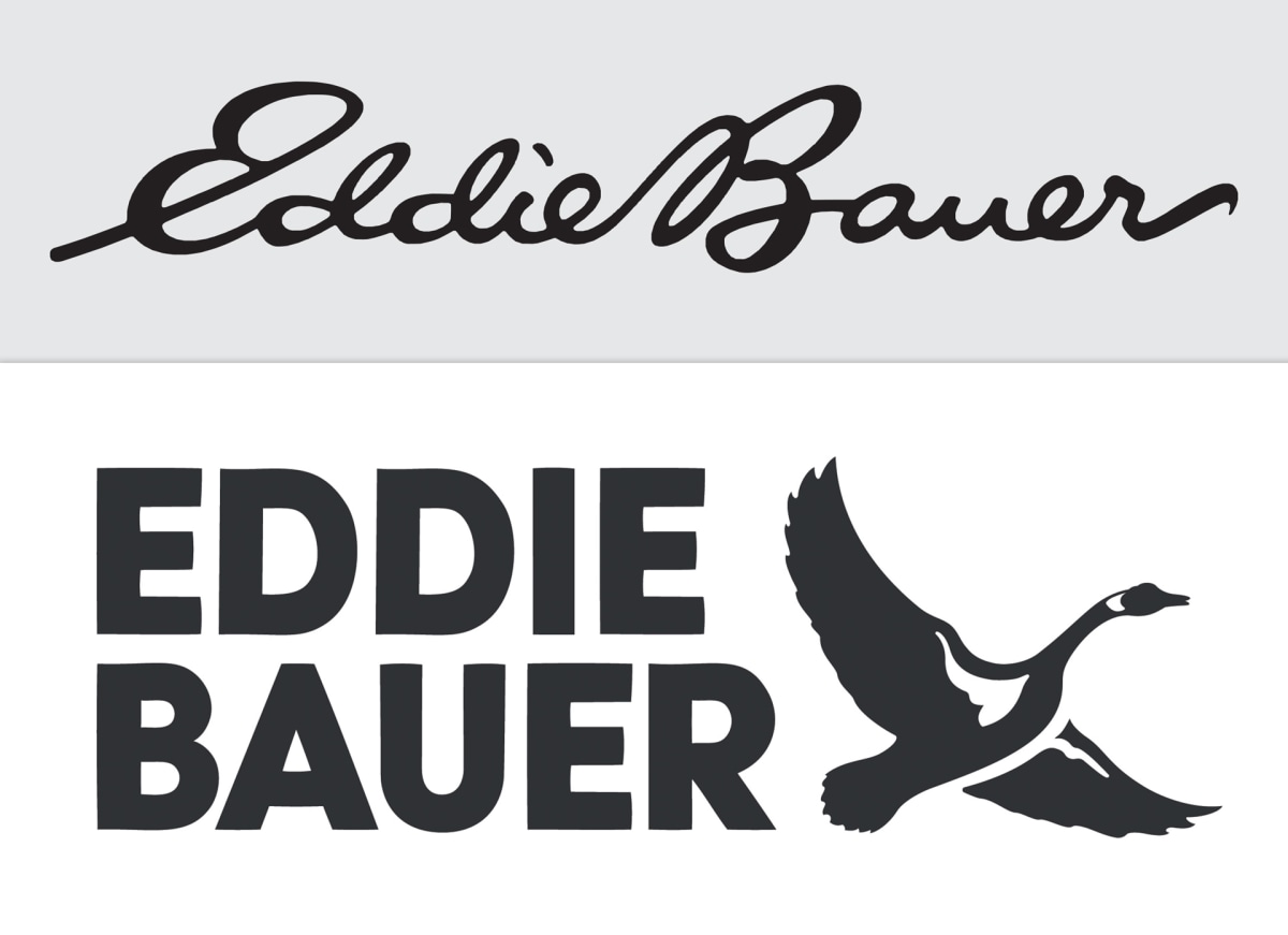
Image: Eddie Bauer.
The old logo had to go.
In my first post-college job as a teaching assistant, one of my tasks was to correct the third graders’ cursive workbooks because the teacher found it boring. I, too, found it boring. Doubtless, the kids found it boring.
Nowadays, not much energy is expended on penmanship, and one of the consequences is that companies are realizing that children are growing up unable to read brands’ famous logos.
Grace Snelling reports at Fast Company, “After 59 years, outdoor outfitter Eddie Bauer is trading its cursive logo for something a bit more tangible: a goose.
“But not just a goose. The bird is accompanied by a simplified version of the brand name, now written in all-caps block lettering. … By fall 2024, all Eddie Bauer products will begin to feature the updated logo.
“The change comes during a period of flux for the brand. Just over a year ago, CEO Tim Bantle joined Eddie Bauer after an extensive career in the outdoor goods industry. … As he researched the brand’s history and spoke with employees, he created a three-pronged approach for expanding Eddie Bauer’s efforts: focusing more on wholesale retail, increasing international distribution, and reaching a new generation of customers. …
“What results is a mix of something old with something new. The goose pays homage to Eddie Bauer’s heritage, hearkening back to the company’s earliest years. In 1936, founder Eddie Bauer was the first to patent a down jacket in the U.S., which happened to be stuffed with goose feathers. Versions of those jackets went on to furnish soldiers in World War II and explorers on Himalayan expeditions. …
“[After the company history] came the issue of legibility.
‘A big part of what I’m going to need to do here is reintroduce this great heritage brand to the next generation,’ Bantle says. ‘And kids don’t even learn to read cursive in school anymore.’
“To avoid a potential communication barrier, he opted for a custom block font created by the design agency Carrewyn Creative. The pivot to sans serif comes just weeks after healthcare giant Johnson & Johnson also retired its 130-year-old script, reflecting a larger trend toward more minimalistic branding in recent years.
“Though it requires a bit of zooming to see clearly, each letter in Eddie Bauer’s new typeface incorporates some imperfections to preserve what Bantle calls ‘a hand-drawn quality’ — an integral aspect of the former logo, which was inspired by Bauer’s own signature. Ultimately, Bantle wanted something approachable both to extreme-sports enthusiasts and people who enjoy simply spending some time outdoors with their pets or loved ones.”
Oh, good grief. The block type has a hand-drawn quality that you need to know to zoom in on if you want to appreciate it? That is getting a bit in the weeds.
But back to the subject of cursive. Do you know children who are learning it? Do they like using it? Can they read other people’s script? I guess I can handle seeing script logos converted, but I was worried when I heard some companies were dropping apostrophes out of logos in countries that don’t have apostrophes. Have you heard of that?
More at Fast Company, here.


