Feeds:
Posts
Comments

Posts Tagged ‘illustrator’

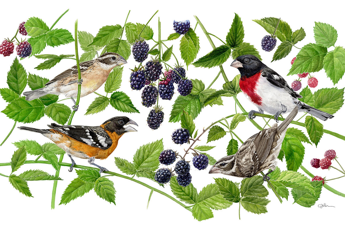
Art: Charlotte Holden.
A watercolor by Charlotte Holden, one of the artists in the Bartels Science Illustration Program at the Cornell Lab of Ornithology in Ithaca, New York, was used on the 2023 mug sent to members of the Ornithology Lab.

Our family has a lot of bird mugs. You may have some, too, especially if you have supported any environmental organization. As important as it is to protect creepy crawly insects, say, or an ugly fungus, those things don’t make great tea cups. Everyone, however, loves birds.

Today’s story is about the contemporary artists behind the bird art on your holiday cards, calendars, and coffee mugs.

Stephanie Hanes wrote at the Christian Science Monitor, “When international researchers recently discovered that a population of hummingbirds in South America was actually two distinct species – a finding made after much trekking and tracking and genome sequencing – they called on Jillian Ditner to help explain their work.

“Ms. Ditner is a bird illustrator at Cornell University’s Lab of Ornithology. And in her rendering, she could highlight the distinctions between Patagona gigas, the southern giant hummingbird, and Patagona sp. nov., the new northern giant hummingbird. …

“The birds look nearly the same. But look closely, and the plumage on the right has a bit more reddish-brown saturation. There is more distinct coloration around the northern’s neck; a beak that extends just a bit longer. 

This is one of the skills of the bird illustrator. More so than a photographer, Ms. Ditner explains, these artists can accentuate and highlight differences in species.

“They can exaggerate just a bit the ideal features that help reveal an animal’s distinct parts; play with that boundary between reality and understanding. 

“ ‘Photographs are always going to be limited,’ she says. ‘With scientific illustrations – you can take endless angles of a photograph and put them in one picture … there’s the ability to condense a lot of detail into one visual.’

“Ms. Ditner runs Cornell’s unique Bartels Science Illustration Program, a year-long fellowship for bird artists that has seen skyrocketing popularity since its founding two decades ago. (This year, Ms. Ditner received 215 applications for the solo spot; that’s up from a few dozen, she says, when she started in her position six years ago.) The Bartels program is part of Cornell’s Lab of Ornithology, which many birders in the area just call ‘the Lab.’ …

“At a time when a global library of digital images lives in one’s pocket, when attention is fought over and commoditized, there is something precious about the act of deep observation and the hand-drawn beauty that science illustration requires.  

“The bird artists at the Lab are specialists in that larger field of science illustration, a profession that includes everything from botanical sketches and renderings of the solar system to medical drawings and wildlife art. 

“Despite advances in both photography and artificial intelligence, the scientific illustration field is growing, say those who work in the field. According to The Franklin Institute, Philadelphia’s renowned natural history museum, new technology has only increased the need for science illustrators, who can help bring either nanoparticles or galaxies to a comprehensible scale; a handful of colleges have science illustration programs.

“Charlotte Holden, an artist and longtime bird lover, was one of the Bartels Illustrators in 2002. During her time in the program, Ms. Holden worked with researchers, studied bird anatomy, and honed her realism style by combining bird images with illustrations of their native flora. Like many who go through the program, her work appeared in Cornell’s Living Bird magazine, on posters, and on other materials. …

“Although Ms. Holden has been watching birds ever since she was a child outside of New York City, it was only by drawing, she says, that she began to recognize details like a bird’s different feather groups, or unique colors. 

“It’s like life, she says. It’s hard to see the details when everything is in motion. Ornithological art slows us down. It has a long history that blurs science and art and wonder; a moment to pause and appreciate the world around us. …

” ‘Art in itself is just very inspiring,’ says Maria Klos, a 2023 Bartells Illustrator who now lives in California. ‘It seems to always draw people in.’  

“One of Ms. Klos’ projects during her time in the program was to draw a pair of life-size American condor wings, which are now attached to one of the Lab’s exterior walls. Visitors can put their arms up against the image to see how their own ‘wingspans’ measure up; one more moment of art, bird, and human together.  

“Both Ms. Klos and Ms. Holden have continued their jobs as professional illustrators; both recently put on shows of their art and both say they are inspired to continue drawing nature professionally. The Bartels program has opened doors to new professional contracts, they say, but also a new way of seeing the world.

“ ‘It fosters a deeper connection to nature … when you just sit with it and observe it,’ Ms. Klos says. ‘You see things that you might have been overlooking for a long time, or might never have noticed if you didn’t sit down with it and draw it.’ ”

More at the Monitor, here. No paywall.

Read Full Post »

Art: Charlotte Strick.
All the decision-makers loved Strick’s cover for Karl Ove Knausgaard’s famed series. Until they didn’t. Read the story of “killed covers.”

Beginning authors often fantasize about the illustration they want for their cover, learning quickly the choice isn’t up to them. Meanwhile, illustrators may think they got the cover job — only to find out how a sales mentality can overrule good design.

Zachary Petit at Fast Company begins today’s story with one illustrator’s experience with a book series I have read.

Charlotte Strick was on a high,” he writes.  “She’d been tasked with designing the book covers for the English translations of Karl Ove Knausgaard’s six-part autobiographical novel, My Struggle — and she’d landed on a concept to tie the volumes together. Perhaps surprisingly, everyone else had, too. The collaged, Easter egg–laden set was an immediate hit in cover meetings at Farrar, Straus and Giroux, and the first book had hit shelves, but then Strick says a literary agent intervened. The books looked too artsy, and he wanted something more straightforward to reach the masses. So with only one installment on the market, the line got scrapped for a more traditional look — author photo with big, clean type, and a solid blurb.

“ ‘There’s nothing scarier than [someone saying], “this book is not going to sell with that cover,” ‘ Strick says. …

“Strick says that in general, the process begins with a designer receiving the manuscript and a jacket brief outlining the mandatory elements (e.g., title, author name, maybe a blurb), and comparison titles for reference. The timeline is usually tight, and when it comes down to it, the creative stakes are high: You’re essentially tasked with creating a single image to brand thousands of words that could have been years in the making. …

“From there, designers create comps, or a series of proposed designs for the team to weigh. The reasons why some comps meet untimely ends are many, from an editor or marketing lead’s personal preferences to genre conventions to performance metrics of similar approaches to the author’s best friend’s opinion or, maybe, the sheer fact that an exec has a cold that day. Of course, this isn’t to say that what hits the market is bad — in fact, I’d contend we’re in a golden age of book cover design, with each publishing season bringing a deluge of insanely great jackets. But at the end of the day, a lot of fantastic and fascinating work hits the cutting room floor.

“So as ‘Best Book Covers of the Year’ lists pop off this month, let’s celebrate the work that didn’t win the day. Here are some of the best book covers of 2023 that you did not see — with insight directly from the designers who created them. 

The version that ended up being scrapped is on left, the final version is on the right.

“ ‘I love the cover that was chosen so much (the big dark waves backdropping the brittle lines of sheet music evoke the sweeping story and emotional impact), but there is one outtake that is stuck in my head when I think of the book. There is one scene at the end that I can’t let go of: Music tying two people together is played, and images of people lost appear in redacted colors of light. Whether real or illustrative, this is the image that held everything that happened in the story in a suspended moment before the exhale of finishing the book. I wanted to create that scene but without any visual clutter of a setting, other objects in the room, or even people. In this outtake everything but the crucial information fades to black. It is the simplicity and starkness that I find so appealing.’ Math Monahan, illustrator of the Refugee Ocean’s first cover.

I’ll Be Seein’ Ya by Jon Robin Baitz is a play set in turbulent COVID times, examining the relationship between nostalgia and the ever-looming anxieties surrounding mortality and old age. I began with this painting by artist Perry Vásquez. The spontaneously combusted palm tree captured the sudden, disorienting, and solitary atmosphere of living alone in pandemic times, while also alluding to the LA forest fires. I enjoyed how this symmetrical, two-paneled composition suggests a ‘before and after’ sequence marking the initial spark and the gradual expansion into forest-fire-orange California sunset. —Cecilia Zhang.’ ”

I like Zhang’s concept more than the one that prevailed, but then, I would. I haven’t forgotten a negative experience I had with Jon Robin Baitz the time I was assigned to interview him for TheaterMania. He was really full of himself and rude because a stringer such as I was (who gets $70 for working hard on the writing) may not have had a chance to see the play.

But back to book covers. What are your reactions to book covers? Laurie Graves does get to pick hers and Asakiyume has done that, too. But when any of us put on our reader hats, we often get indignant about a cover we think was very misleading. Let me know if you can think of an example.

See more Befores and Afters at Fast Company, here.

Read Full Post »

Maria Popova at Brain Pickings has wide-ranging interests, and one of her special strengths is finding charming children’s books. In a recent post, she wrote about an alphabet book you can get at the library.

“I was instantly taken with Work: An Occupational ABC (public library) by Toronto-based illustrator and designer Kellen Hatanaka — a compendium of imaginative, uncommon, stereotype-defying answers to the essential what-do-you-want-to-be-when-you-grow-up question.

“With a sensibility between mid-century children’s books and Blexbolex [a French graphic artist described here], Hatanaka weaves bold graphics and soft shades into a tapestry of tender vignettes about people of all shapes, sizes, and colors. There is the K-9 officer (female) training her trusty dog on an obstacle course; the Butcher (heavy-set) chasing after a mischievous raccoon that got away with the sausage; the Naval Architect (female) oversees the construction of a large ship near the shore as the Oceanographer (female, dark-skinned) explores the marine world below the surface.”

Canadian independent children’s-book publisher Groundwood Books is to be commended for this little treasure. You can see most of the pictures in Popova’s blog post, here. They are completely delightful.

Art: Kellen Hatanaka
Vibraphonist from Work: An Occupational ABC

Read Full Post »

Author-illustrator Jarrett Krosoczka knows the power of a kind word. He found his calling largely because of two words from a children’s book author who visited his elementary school class.

And he got through a difficult childhood nourished on the kindness of strangers, including lunch ladies, an unjustly maligned species he has honored in a superhero series. (“Serving justice! And serving lunch!)

Linda Matchan has a lovely story at the Boston Globe about Krosoczka.  (I want to call your attention to how nicely she describes him, here: “with impossibly spiky hair that looks as though he penciled it in himself.”)

“Until recently,” writes Matchan, “Krosoczka was very guarded about his childhood. That changed last October when he got a call from the organizer of a TEDx program at Hampshire College, modeled after the TED Talks series. …

“Scrambling for a topic, his wife urged him to talk candidly about his childhood. With no time to come up with other options, he delivered a moving talk about his early years and the people who inspired and encouraged him. The talk caught the attention of the TED editorial team, which featured it in January on TED.com.

“He spoke in his talk about his mother — ‘the most talented artist I knew’ — who was addicted to heroin and often incarcerated. ‘When your parent is a drug addict it’s kind of like Charlie Brown trying to kick the football … Every time you open your heart, you end up on your back.’ …

“Third grade was the year something ‘monumental’ happened. Children’s book author Jack Gantos came to his school to talk about what he did for a living. He wandered into the classroom where Krosoczka was drawing, stopped at Krosoczka’s desk and studied his picture.

“ ‘Nice cat,’ Gantos said.

“ ‘Two words,’ said Krosoczka, ‘that made a colossal difference in my life.’ ”

More.

Photo: Bill Greene
Jarrett Krosoczka declared May 3 (his favorite lunch lady’s birthday) “School Lunch Superhero Day.”

Author-illustrator Jarrett Krosoczka knows the power of a kind word. He found his calling largely because of two words from a children’s book author who visited his elementary school class.
And he got through a difficult childhood nourished on the kindness of strangers, including lunch ladies, an unjustly maligned species he has honored in a superhero series. (“Serving justice! And serving lunch!)
Linda Matchan has a lovely story at the Boston Globe about Krosoczka.  (I want to call your attention to how nicely she describes him, here: “with impossibly spiky hair that looks as though he penciled it in himself.”)
“Until recently,” writes Matchan, “Krosoczka was very guarded about his childhood. That changed last October when he got a call from the organizer of a TEDx program at Hampshire College, modeled after the TED Talks series. …
“Scrambling for a topic, his wife urged him to talk candidly about his childhood. With no time to come up with other options, he delivered a moving talk about his early years and the people who inspired and encouraged him. The talk caught the attention of the TED editorial team, which featured it in January on TED.com.
“He spoke in his talk about his mother — ‘the most talented artist I knew’ — who was addicted to heroin and often incarcerated. ‘When your parent is a drug addict it’s kind of like Charlie Brown trying to kick the football … Every time you open your heart, you end up on your back.’ …
“Third grade was the year something ‘monumental’ happened. Children’s book author Jack Gantos came to his school to talk about what he did for a living. He wandered into the classroom where Krosoczka was drawing, stopped at Krosoczka’s desk and studied his picture.
“ ‘Nice cat,’ Gantos said.
“ ‘Two words,’ said Krosoczka, ‘that made a colossal difference in my life.’ ”

Read Full Post »

Looking at streams swollen by yesterday’s rain, I began thinking about Scuffy the Tugboat.

“The water moved in a hurry, as all things move in a hurry when it is Spring. Scuffy was in a hurry, too. ‘Come back little tugboat, come back,’ cried the little boy.”

Remember?

A farmers market in Providence was undaunted by the rain. The farmer at the farmstand here joked that the puddle was just a matter of hydroponic gardening. In other photos, I show peonies and a sign buffeted by the storm — and a rabbit too busy foraging to worry about cameras.

Read Full Post »

Back in December, Asakiyume and her daughter and I went to see a graphic art exhibit in Fitchburg. We were all quite taken with a dark, wordless story that Lynd Ward carved nearly a century ago. So I thought I would mention that, according to the New York Times, a documentary about Ward will be shown in Maine next Saturday.

Scroll down in a column by Eve Kahn, here, to the subhead “An Illustrator’s Life.”

“The prolific illustrator Lynd Ward had fans as diverse as superhero-comic-book collectors, the poet Allen Ginsberg and the graphic novelist Art Spiegelman. In the 1920s and ’30s Ward carved woodblocks for wordless books about capitalism’s oppressive side effects. …

” In later years Ward mainly illustrated stories by other authors, but his compassion for the underdog still came through, especially in his 1942 watercolors for Hildegarde H. Swift’s ‘Little Red Lighthouse and the Great Gray Bridge.’ ”

The Times reporter interviews filmmaker Michael Maglaras, who “has devoted much of the past two years to a new movie, ‘O Brother Man: The Art and Life of Lynd Ward,’ which will have its premiere on March 31 at the Maine Festival of the Book in Portland.

“Mr. Maglaras and the producer Terri Templeton based the film partly on archives that the family preserved after Ward’s death in 1985, and they extensively interviewed Ward’s younger daughter, Robin Ward Savage.”

Now, that is a movie I would like to see. Here’s a clip.

Read Full Post »

I went to the Concord Library today to hear children’s book author and illustrator Ed Emberley give a charming talk to a crew of little kids sitting on a rug.

Emberley used an easel and colored chalks to demonstrate simple ways to create pictures. It was clear that he was used to talking to young children and loved making them laugh. The kids responded gleefully. Grownups did, too.

Several fans asked him — and his wife and collaborator, Barbara — to sign books they had brought along. One woman told me that her kids, now grown, still knew all the words to the Emberleys’ book Drummer Hoff, winner of the 1968 Caldecott Award for  illustration.

I took home a worksheet with Emberley’s drawing tips so I can do more-interesting doodles in long meetings at work.

Read Full Post »