Feeds:
Posts
Comments

Posts Tagged ‘publishing’

Photo: David M Benett/Getty Images.
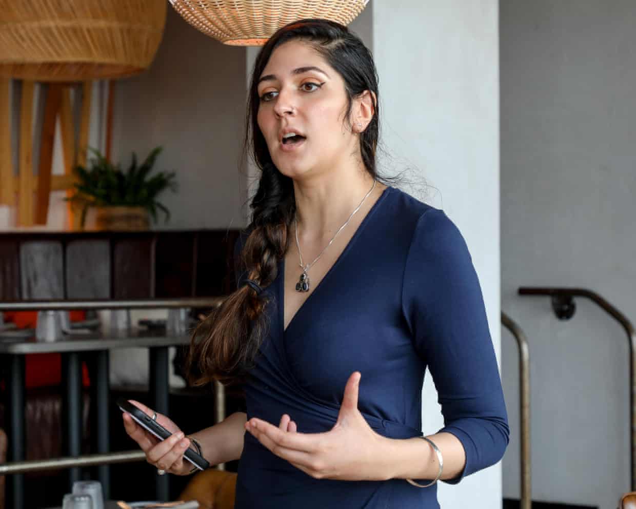
Poet Nikita Gill built a following on Instagram.

It’s funny but the poetry slams I’ve written about before — hip-hop-like, shouted performances that showcased new, nontraditional poets — already seem like a stage in literary history. And their significance seems to lie in their emphasis on connecting with audiences, getting “in your face.” No distancing “poet voice” for these folks!

Social media, too, is all about the need for connection, and that is where you’ll find the newest poets building audiences.

Ella Risbridger has some opinions at the Guardian.

“The death of poetry – much anticipated, much prematurely mourned – has been put off again, this time by the Odyssey. Thanks to Christopher Nolan’s film, sales of Homer’s epic rose 1,400% in the weeks around release – and it’s not alone. Poetry collections are once again sailing up the charts: Lucas Jones, Donna Ashworth and Nikita Gill, among others, have all burst forth on to the bestseller lists. …

“Poetry is a genre more often relegated to the adolescent, the academic, or the words inside sentimental birthday cards: either over-emotional or elitist, depending on which poet and which perspective. What it certainly is not is a money-spinner: nobody gets into poetry to make the big bucks. Nobody gets into poetry – not these days, anyway, not since Byron’s day – for the fame or the fortune.

“Poetry is the underdog of publishing and yet this year, according to a recent Guardian article, it is ‘expected to exceed £15m [$20 m] in annual sales for the first time since records began.’ … Even without the bolstering influence of Homer, poetry has been steadily climbing for the last three years, each one the best on record.

“In fact, reports of poetry’s surprising rise have been kicking around for more than a decade: Rupi Kaur’s million-dollar debut, Milk and Honey, set new records in 2014, and continues to sell. US magazine the New Republic named Kaur the ‘writer of the decade.’ And yet she came to stand not so much for great art, as for a kind of synecdoche for what was wrong with art: Kaur became the mockable face of ‘the new poetry.’ …

“A new audience is finding poetry, particularly (though not exclusively) through social media: a new generation of poets, particularly but not exclusively performance poets, have come to prominence through Instagram, TikTok, and other short-form video formats. These writers, while we can quote them on the page, lose something by being written down.

“ ‘At my funeral I’d like there to be sunflowers, a truly inconvenient amount / For I too will have spent a lifetime searching for the light,’ runs a couplet from Harry Baker’s ‘Sunflowers,’ but the poet’s charismatic presence somehow conveys something more of the full power of his meaning.

“Many of these poems, beginning on social media and ending in huge sold-out tours, rely on a connection between speaker and listener: a pause, a stillness, a sustained thread in the chaos of the internet, of singular attention to one poem through to the end.

“This is poetry for the social media age, for sure. But then, what is the Odyssey except social media [meant] to be read out loud; to be told; to be spread; to be shared. …

“It is tempting to think of these bestsellers as a new kind of poetry, but it is in fact a very old one. It is unafraid of emotion, of sentimentality, of faith and love; it is concerned less with the establishment of a brand new voice than with the need to give voice to a collective thought. It is not about originality. (Hence, perhaps, the accusations of self-help; banality; and even plagiarism that have been flung at some of these newly popular poets.) These are poems designed to resonate rather than to disturb. In times of division, these poems are made to connect.

“All writing is about connection, even when it’s not. But the immediacy of the connection between author and reader is somehow easiest in poetry: when it works, there’s a direct shot to the heart, a human-to-human hot-wiring together that compresses time and space to get to the point.

“What social media offers these poets is a new way to gather people round the fire – and, for some, a way to get to be the one speaking at last. If poets can reach their audiences directly, then different poets may be, perhaps, given a chance not just to speak but to be heard: working-class poets, queer poets, poets who don’t fit the … classical canon.”

Read up on “five bestselling poets you should know about” at the Guardian, here. No paywall.

Read Full Post »

Photo: Maxine Wallace/The Washington Post.
Books with decorated page edges (spredge) are becoming increasingly popular.

Although I always liked the designs on the edge of pages in fancy, old-time books, I never thought about all the ways you can use so-called “spredges” to convey the appeal of your book in the bookshop.

Sophia Nguyen writes at the Washington Post that the phenomenon has recently gained adherents.

“Sumptuous fore-edges — sprayed a bright color, stenciled with city skylines, made to look like pointy teeth — used to be relatively rare. But in recent years, publishers have brought decorated edges to the masses. Edge-painted books are now so widespread that you can find them at Walmart. The feature has spread from romance and fantasy to horror, thrillers and even literary fiction; it’s spread from works by famous authors with ravenous followings to those by debut novelists hoping to make a splash. It even has a (horrifying) portmanteau: spredges. On social media, readers show off floor-to-ceiling shelves crammed full of these books — spines facing inward, of course.

“Jim Sorensen, president of Lakeside Book Company, the largest book manufacturer in North America, recalled the time a decade ago, when a colleague brought back edge-printing samples from a work trip to Europe. ‘Honestly, there wasn’t a whole lot of interest’ from clients, Sorensen said. Times have changed. …

“The surge was driven by a few corners of the publishing world. Subscription companies, such as LitJoy Crate and Illumicrate, seeded interest (and a sense of exclusivity) among readers as they printed relatively small runs that quickly sold out. Self-published authors, selling special editions of their books on their personal websites or at conventions, also helped to popularize the look. This prompted publishers to invest in the trend. When, in 2023, Bloom Books sprayed the pages of Elle Kennedy’s Off-Campus novels in powder blue, the set hit the bestseller lists — an unusual success for a collector’s bundle. …

“Barnes & Noble, after seeing the trend take off with the exclusive editions sold by its sister chain Waterstones, now devotes an entire section of its website to decorated, stenciled and sprayed edges. Decorated edges have ‘developed into an extension of the book experience itself,’ said Shannon DeVito, director of books at Barnes & Noble.

“The printed-edge craze has also opened up a new business niche. Inspired by DIY videos, Stephanie Moreno launched an edge-painting service this year, including live painting at author events. What, after all, could be more limited than an edition only offered at a single local signing? …

“For designers, the edge gives a whole new surface to play with and another opportunity to make a book recognizable. ‘From a creative standpoint, it’s thrilling,’ said Molly Waxman, executive director of marketing for adult fiction and nonfiction at Sourcebooks. Logistically, there were some kinks to work out, she added — such as building in time for ink to dry, so pages don’t curl unattractively.

“As printed edges have flooded into stores, ramping up the competition for eyeballs, ‘the bigger race is being able to manage all of these specs and still hold a price point that’s not going to be so difficult for a consumer,’ [Bloom editorial director Christa] Désir said. …

“When, in the 1500s, people in the English-speaking world started storing their books upright and on shelves — moving them from chests and lecterns — they stored them just as many TikTokers do: with pages facing out. Title information was printed there in ink, said Mark Purcell, director for research and collections at Cambridge University’s libraries and archives.

“Then, starting around the early 1600s in England, modish bookbinders started gilding titles on the spines of books, and so collectors started to reverse their displays. The practice spread gradually and unevenly over a century-and-a-half in what’s called ‘the Great Turnaround.’ 

“ ‘It depends where you are, how up-to-date you are, how fashionable you are, how wealthy you are, what your library is like, all sorts of things,’ Purcell said. …

“He did note one possible practical consideration favoring the old way: Some libraries threaded chains through their collections for security reasons, and the system only worked with the pages facing out.”

More at the Post, here.

Read Full Post »

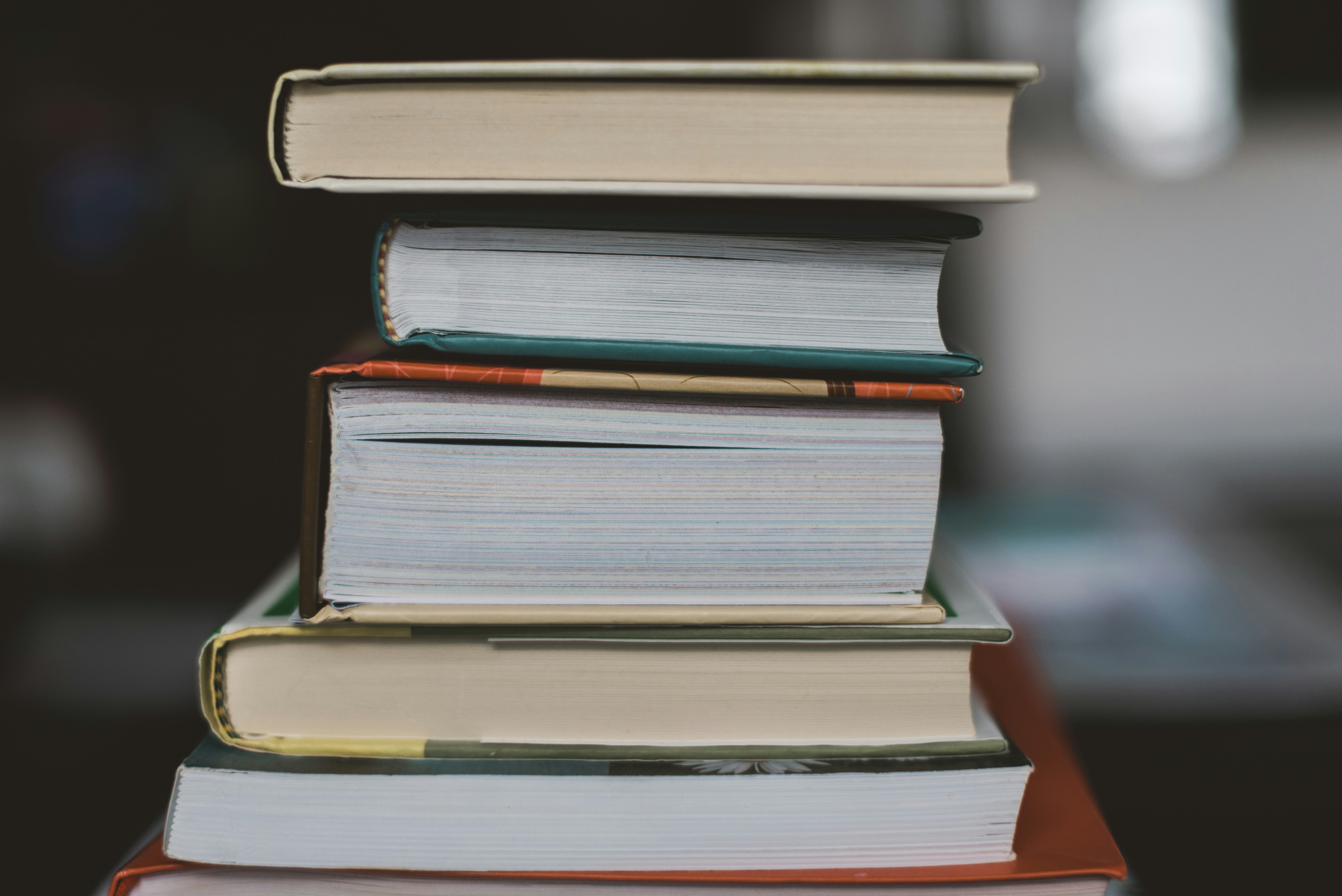
Photo: Claudia Wolff/Unsplash.
Do books use too much paper?

Those of us who still prefer a solid book to a pale, digital imitation may sometimes wonder whether we are encouraging the use of too much paper, especially since overstocks can end up in landfills.

Curiously, at least one publisher is thinking along the same lines.

Elizabeth Segran writes at Fast Company, “Over the past three years, HarperCollins’s designers have put their skills toward a new mission: saving paper. In an effort to reduce the carbon footprint of each book, they’re tweaking fonts, layout, and even the ink used. The goal is to pack more into each page, while ensuring that the pages are as readable as ever. And so far, these subtle, imperceptible tweaks have saved 245.6 million pages, equivalent to 5,618 trees.

“HarperCollins’s Christian publishing division, Zondervan Bibles, first came up with the idea of using design to save paper. Bibles have historically used upwards of 2,500 pages. In 2015, Zondervan’s designers determined that if they used different fonts and adjusted the page layout, they could reduce the number of sheets used. It would also cut HarperCollins’s printing costs. They developed a new compact typeface called the NIV Comfort Print. Ultimately, it saved more than 350 pages per bible, resulting in a total savings of 100 million pages in 2017. Stacked up, that would be the equivalent to four times the height of the Empire State Building.

“Tracey Menzies, the VP of creative operations and production at HarperCollins, wanted to see if the company could apply these learnings to other kinds of books. … The team got to work. They tested their theories with a large book in their catalog — more than 600 pages — by creating 50 versions of it using different fonts. HarperCollins uses a wide range of off-the-shelf fonts in its books, rather than custom ones. As the team ran the experiments, they observed that some fonts were more compact, resulting in fewer total pages, while remaining easy to read. So they curated a list of 15 fonts they determined are the most eco-friendly, which will be the preferred fonts from now on.

“In the end, the designers found that clever font selection, coupled with a thoughtful layout design that reduced white space, resulted in more words per page. For instance, in one example, the same text set to Garamond Pro resulted in many more words on the page compared to Bembo. Both fonts are fairly similar, with a classic serif look. And when you place them side by side, the differences are imperceptible. ‘The goal is to make these changes without the reader even seeing the difference,’ says Menzies.

“But there were also many complexities in the process. For instance, they had to consider the heaviness of the font. One font they used frequently is Bodoni, which was first created in 1798, and appears frequently in HarperCollins books. As a very heavy font, they realized they could fit more words on a page, while keeping it readable. But they also found that with very large letters, like subheadings, the ink would bleed through the paper, making it hard to read the words on the next page.

“ ‘The designer is always balancing out not just a single page, but also what’s on the page before and the page after,’ says [Leah Carlson-Stanisic, associate director of design at HarperCollins]. ‘Ultimately, this ended up with finding fonts that used less ink, in addition to less paper, which is also better for the planet.’

“Still, there is complex math involved with cutting pages from books. Printers produce very large sheets, which are then cut and folded into what ultimately becomes segments of 16 pages. When trying to cut pages from the book, designers need to be able to remove multiples of 16 pages. For the book So Fetch, for instance, using a more eco-friendly font saved nearly a million pages in total over the entirety of its print run. ‘We want to make sure our big titles, by prominent authors, are using these eco-fonts,’ says Carlson-Stanisic. ‘It adds up a little bit at a time, saving more and more trees.’ …

” ‘When we experimented with these fonts, we realized they weren’t a limitation at all,’ Menzies says. ‘It was simply a different approach that didn’t sacrifice aesthetics. Now, our designers are constantly questioning how we do things and thinking about ways to make things more sustainable.’

More at Fast Company, here.

Read Full Post »