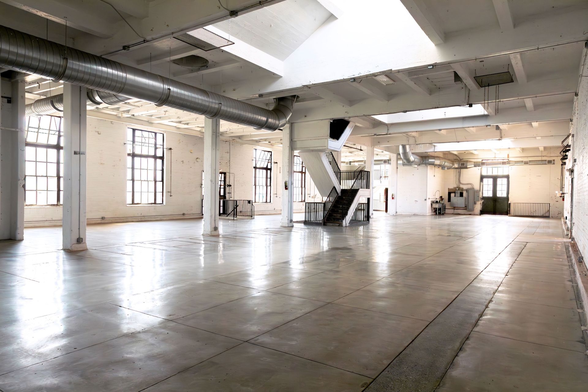
Photo: Isabel Kokko, Forman Arts Initiative, Philadelphia, via the Art Newspaper.
Inside the former electrical substation as it appears today. The Forman Arts Initiative plans to renovate four buildings in Kensington to hold a gallery, performing arts venue, garden area, and FAI offices.
One of the cool places I get leads from is ArtsJournal. The variety of topics is great because they check out way more sources than any one person could monitor (or pay the fees for). Today’s story is from the Philadelphia Inquirer and covers an art initiative not far from where I used to live in Pennsylvania.
Rosa Cartagena writes, “A new 100,000-square-foot arts campus coming to West Kensington will open in stages over the next two years. The Forman Arts Initiative, an arts organization that awards grants to local creatives and arts nonprofits, plans to renovate four buildings on American Street. The multipurpose space will hold a gallery, performing arts venue, and garden area, in addition to FAI’s offices.
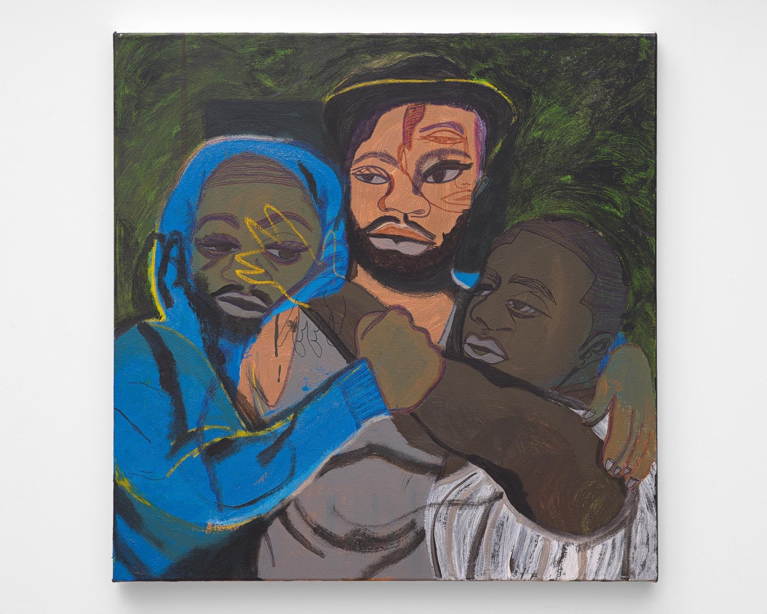
“Michael Forman and Jennifer Rice, the art-collecting couple behind FAI, envision the campus as a cross between an arts center, coffee shop, art-making studio, and gallery space where they can publicly display their collection of more than 800 artworks. The collection — largely works from artists of color and women — includes such names as Philadelphia ceramist Robert Lugo, legendary photographer Gordon Parks, and abstract painter Alma Thomas.
“ ‘We live with our art, and we think of our collecting more as stewardship than ownership,’ said Rice. … ‘We’re really looking at using art as a tool for education, community engagement, performance, and inspiration.’
“In late 2022 and early 2023, the couple purchased a vacant lot and four adjoining buildings on the 2200 block of American Street. … FAI will work with Philadelphia architecture firms DIGSAU and Ian Smith Design Group to transform the 100,000-square-foot site. Forman said it’s too early to know how much the restoration and renovation will cost, but FAI plans to finance it internally and will seek government funding and potential support from local foundations.
“FAI has also attracted one of the most influential people in the art world to serve as lead designer: urban planner and sculptor Theaster Gates. Forman and Rice first connected with him as collectors of his art and when they began developing plans for the campus, they approached Gates for his unique style that combines ‘social practice and art practice,’ said Forman.
“In Chicago, where Gates lives and works, he is renowned for repurposing abandoned industrial buildings into arts spaces, archives for Black culture, affordable housing, and artist residences that have revitalized a South Side neighborhood.
“Philadelphia has been a site for his artwork, as well. In 2020, Gates created the public work Monument in Waiting, in a response to the movement to tear down Confederate monuments. The sculpture, which critically questions national heroes, has been on display at Drexel University since 2022. …
“FAI is undertaking an extensive listening tour to determine what exactly the West Kensington neighborhood needs and wants from a space such as this. Gates will work with newly appointed FAI executive director Adjoa Jones de Almeida, who was previously at the Brooklyn Museum, and associate executive director Sunanda Ghosh, a local nonprofit strategist who has worked with BlackStar and Asian Arts Initiative, among others.
“ ‘We are very intentionally saying to people, “We actually don’t know,” because, truly, we are emphasizing the design of a communities engagement strategy,’ said Jones de Almeida, who moved to East Kensington earlier this year. The plan is to incorporate input from the neighborhood’s residents and organizations into the design of the space.
“She’s interested in ‘radical collaboration’ with neighborhood organizations such as the Norris Square Neighborhood Project and Taller Puertorriqueño, both recipients of last year’s FAI grants. …
“Forman and Rice believe that West Kensington is the best location because, despite being systemically overlooked and under-resourced, the community has a strong arts community, including Crane Arts and the Clay Studio.
“ ‘We were interested in the notion that we’re not displacing anybody — the buildings that we bought were all commercial,’ said Rice. ‘It’s just repurposing.’ …
“ ‘You have to enter with big ears and an open and pliant heart,’ said Gates. ‘The work of creating a creative space and making a significant investment in a place that’s been highly underinvested is hard work when you’re trying to really listen, because there’s a lot of bruised feelings.’ ”
More at the Inquirer, here. And the Art Newspaper version has no paywall, here.


